Valuable Matplotlib & Seaborn Visualization Handbook, Part II
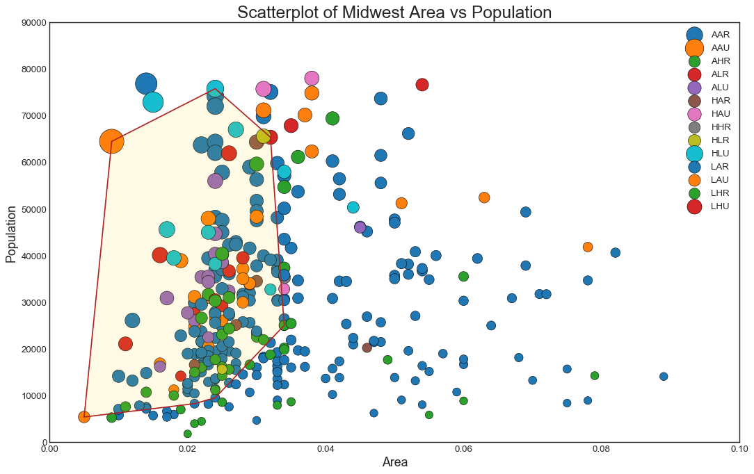
This post summarizes the top 50 most valuable Matplotlib & Seaborn data visualizations in data science. It can be taken as a data visualization handbook for you to look up for useful visulaization. The 50 visualizations are categorized into 7 different application scenarios, and this post would mainly focuses on the first two categories, shown as follows: Correlation, Deviation, Ranking, Distribution, Composition, Change, and Groups. The whole content is divided into three parts, and this post is Part II. We will cover Ranking and Distribution in this post.
